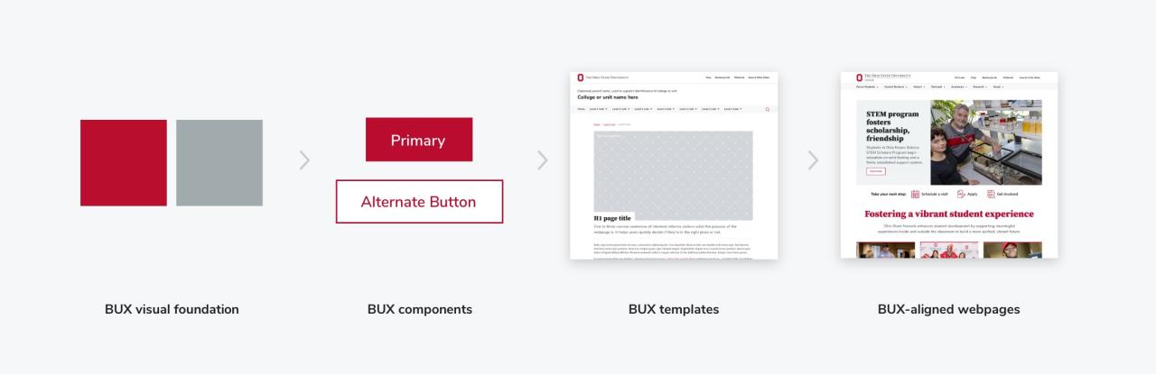
BUX 101 Guide

Learn the ins and outs of Ohio State’s design system for web, Buckeye User Experience (BUX). With this guide, web content creators will be able to create design-aligned, user-friendly and accessible web pages within our Drupal CMS (Content Management System).

What is BUX?

“BUX” stands for Buckeye User Experience. It's a design system of components that follow the design aesthetics of Ohio State, function in a consistent manner, as well as integrate accessibility standards and guidelines. By using BUX components in our Drupal CMS, our web audiences to come to recognize the way we intentionally use design to represent Ohio State. BUX allows our Buckeye community to have a familiar experience on all Ohio State web applications.

BUX atomic design system including foundations, components, templates and final webpages

BUX uses a Atomic Design System methodology to scale our design. Foundations (colors, fonts, etc) establish the ground rules for the entire system. Foundational elements are combined to create functioning, reusable components (buttons, lists, links, cards, etc). Components are combined to create templates, a starting point for displaying common content, like a Directory. With the addition of real text and images, a template can evolve to a functioning, live webpage. The BUX website includes design templates and a list of all components that are currently part of the system. For each component, you'll find a short description, a live code demo, usage dos and don'ts, and more. 

BUX best practices

Along with the visual design, usability also needs to be considered for a successful webpage. When you are maintaining your content, consider these web best practices.

1 Create visual hierarchy

Visual hierarchy helps users scan through the page in a logical order, and breaks up large pieces of content into readable, retainable chunks. A few quick tips for good hierarchy are to use headings 1-6 correctly, utilize lists where necessary, and display calls-to-action (Buttons, Links) differently so users know what the goal of the page is. Learn more in our BUX blog: Creating Effective Webpage Designs with BUX

2 Use photography with intention

Photography creates and reinforces recognition of Ohio State’s faces and places. On a webpage, imagery should be intentional – supporting the messaging. A great resource to start with is the Signature Gallery in the DAM. If you need unit-specific photography, consider scheduling a photoshoot with the Scarlet Studio. If no high-quality, brand-aligned imagery is available immediately, simply exclude photography and allow the spacious typography to provide visual hierarchy and points of emphasis. 

3 Be concise with text

Modern users tend to scan rather than read through large walls of text. So when writing your website copy, chunk your ideas into smaller pieces. Say what you mean with as few words as possible, and use a variety of components to keep users engaged.

4 Embrace white space

Don't be afraid of white space! It is not necessary to fill every blank area of a webpage. White space is helpful to visually group components, going hand-in-hand with creating hierarchy. White space helps with legibility because it allows the eyes to rest in-between reading content. 

Components

These are the individual elements that make up a page, and you have most of them available as you create a web page. We've grouped them by common use, and each one links to the respective BUX page so you can review the demo, dos and don'ts, and any additional notes.

BUX components of question answer, accordion, text, list, and more

Content

These are basic building blocks of a website. While paragraph text is straightforward and acceptable, these components display text in a more engaging, scannable manner.

BUX components of buttons, links, cards, CTA collections and tiles

Links / Calls-to-action (CTAs)

Whether a CTA is simple, like a link, or more complex, like a Featured Card, it encourages the user to take a specific action, such as going to another webpage.

Examples of BUX components including quote, panel and factoid

Emphasis

These components draw the viewer's eye to a specific area or element within a webpage by using bold color (scarlet, but sparingly) and larger type. While these components can elevate the webpage, they are optional and can be used in moderation among body copy.

BUX components for navigation including menus and sidebars

Navigation

Our page templates contain navigation that allows to user to intuitively move between different pages and sections of the site. Content editors may be aware of the navigation components, but should not need to add them to the webpage.

Accessibility

By federal mandate, Ohio State websites must provide all users with access our digital information, including but not limited to those with disabilities. BUX prioritizes accessibility within all design elements and components. Using BUX components within our CMS helps a website to meet accessibility standards. However, accessibility compliance will vary based on the content. Content editors should consider our accessibility guidelines when creating content. content but content editors can make finale content more accessible.

BUX addresses the following:

  • Sufficient color contrast
  • Minimum font size and clickable areas
  • Default to left-align text
  • Keyboard focus states and skip to content button
  • Lists are defined with correct code

Content editors need to address the following:

  • Include alt text for images
  • Use nested Headings 1-6 in correct and logical order
  • Use link text that is clear and descriptive
  • Link phone numbers and email addresses
  • Create fully accessible PDFs
  • Generate accurate video captions